Free Digital Marketing Review
End-to-end digital marketing services with full-funnel marketing strategy for maximum ROI.
4 Essential Website Features You Need to Gain and Keep Traffic
Whether you’re a seasoned online professional or just starting to dip your feet into the digital water, you’ll likely have explored building a website as a first step. This is a great idea to establish a presence and to provide a place for everyone to see what a superstar you are, but wondering what essential website features you need can be daunting.
Even if you consider yourself an expert in the online world, it’s worth remembering not to gloss over these four simple things that your website needs to thrive.
Refreshing your memory and taking it back to basics will ensure you’re not making these exposure-killing mistakes.
Here are four essential website features that your online home must have in order to thrive and impress your visitors:
A technical website structure that Google and your visitors love
You don’t want to purposely build your website to make it difficult to be found by Google and your visitors, yet you’d be surprised how many people do.
Every page on your website should be accessible within three clicks or you can wave goodbye to your hard-earned visitor.
How annoyed would you be if you had to keep clicking to get to where you needed to go on a website? So peeved I imagine, that you wouldn’t even bother. Your website visitors are no different.
One of the simplest ways to organise the structure and navigation so that every page is available on your site within 2 to 3 clicks is as follows:
Homepage > Category page > Article
This makes everything accessible to your reader in two clicks.
Sometimes an extra step is more appropriate and keeps your website menus tidier.
In the case of your website having a large amount of content, this structure works to get your reader where they need to go in three clicks:
Homepage > Category > Sub-category > Article/product
If you find yourself creating even deeper sub-sub-categories within your menus, you likely have enough content to create a separate category for that topic rather than a sub-sub category.
Common sense prevails here.
Ask yourself if the topic really needs a sub-category or does it fit snugly into a broader category. On the other hand, if you’re finding yourself writing constantly about a particular sub-category, then it might be time to give it the main category it deserves.
Should the backlinks I earn go straight to the top of this structure?

Your SEO link-building strategy, beyond the foundational links you should have created for your site (like your social profiles, and business directory listings), should actually be done in the opposite way. Your earned links should point to articles from the bottom up.
What does this mean?
Think about it – do you ever link to the homepage of a website after you’ve read some amazing content? More naturally, we read an article, enjoy it, and link to the article. Think about news websites.
Google sees it the same way too. As a result, SEOs have coined this way of earning links to your site as the ‘reverse silo’ method.
Again, common sense is a must here. If you’re a service provider and known for one type of product or service, then it’s absolutely fine to earn a link back to your homepage.
It’s important to step into your customer’s shoes and also think about how you behave on the internet also. If it feels like something you would naturally do online, then you’re on the right path.
Gaining links in this manner – if you’ve structured your website navigation as advised above – will spread authority throughout your entire site.
The link you just gained from the external website will now transfer authority to the article on your site to which you linked to.
This in turn will transfer that link juice to the category page that it sits within, and as the category is linked to the homepage, it will then pass through to the homepage too.
The simplest way to explain how the authority will travel if that explanation has left you seeing stars is:
Original link from external website > Your Article > Category > Your Homepage
Bonus Tip: Don’t forget to link internally. If you brush on a topic within your article that is explained in more depth somewhere else on your site, then link to that article. This is an easy and natural way to spread authority internally through your site and keep your reader engaged.
Make sure your website visitor knows EXACTLY what you do

If you’ve ever been on a website where you wanted to find out more information but the navigation bar had no links to the information you were looking for, you know what a nightmare this can be.
After rolling your eyes in frustration I’m pretty sure your next step was to hit the ‘back’ button. The website lost you as a visitor forever.
At best, the website gave you no reason to care about who they are or what they do.
After all, if they didn’t care enough to make it easy for you to find more information about them, then why should you care?
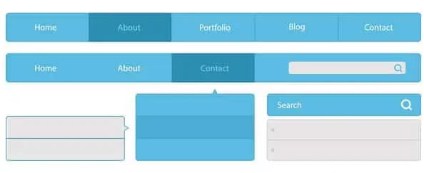
You can avoid being this business by making sure your web design includes a navigation bar and header that leaves nothing to your reader’s imagination.
Include the following things in your header, and navigation bar or at least have this information above the fold:
- A link back to your homepage – your logo should link back to your homepage at the very least
- Your social media links
- Your contact page or a form to get in touch
- Links to your most important pages – what does your business do? What services are offered? What are your USPs?
- Your about page
- A way for YOU to contact your visitors again
By keeping all of this information accessible to your reader, they’ll have no reason to get annoyed and leave should they need more information about your business and what you do.
A way to contact your readers again is essential

Continuing on from the bulleted list above, the final point deserves its own heading for the importance it carries.
If you’re providing high-quality content – and you should be – then your visitors will absolutely want to hear more from you.
If you’re not providing them with the option to stay in touch or putting it somewhere your visitors won’t find it, you’re leaving fans of your business and potential money on the table.
It’s probably the most cliche saying that anybody who’s been in the internet marketing space for even ten years plus will recognise, “The money is in your list!”
The quote still rings true today. What it means is that you should be retaining these valuable readers and visitors on your own email list.
Customers rarely sign up for services on first contact. By having your visitor sign up for your newsletter, you’ll have the opportunity to build trust and impress them over and over again.
Sign up for one of the many email marketing services out there.
You’ll find many newsletter services can be expensive, especially if you’re just starting out.
There are some services that offer free accounts. Two main providers I have used that allow you up to 2000 free subscribers are Mailchimp and Benchmark.
I’d probably lean towards Benchmark as even their free offering is quite robust and offers email autoresponders, while a free account with Mailchimp is limited in features to only broadcast emails.
The difference with a broadcast is that you’ll need to manually email your list whenever you want to contact them with Mailchimp. With Benchmark, you can load up an entire email sequence into your account which will automatically go out to your list at a schedule you set. Much more convenient.
This will be enough to get you started and you can always upgrade when you’re making more moolah from your list.
You’ll be able to create a form from your account and add it to various areas of your website for readers to sign up to.
ESSENTIAL WEBSITE FEATURE TIP – Give your reader a reason to sign up for your list. In a world full of spam, nobody wants to give up their email address willy-nilly.
Offering them something of value like a free course, ebook or something as simple as your article in ‘pdf’ format could be the dangling carrot your visitor needs to sign up.
OBVIOUS TIP – DO NOT spam your reader with nonsense or off-topic stuff they didn’t sign up for. That’s a great way to get spam complaints, get banned from your email provider and lose your list.
Bonus Tip – Try to create some type of engagement that triggers your newsletter signup form. If you can do this, you’ve already created an expectation and a micro-commitment from your reader. Now they’re far more likely to complete the process of signing up because they are expecting it and have asked for it.
Again, think about your own internet browsing experience. How annoying is it when you arrive on a website to read some content and an email form pops up within 0.126 seconds?
The marketing equivalent of walking up to a girl in a bar and opening with, “Get your coat, love. You’ve pulled”.
You wouldn’t trust someone you’ve only just met and the same principles apply here.
Provide visitors with a way to share your content

A topic of fierce debate in the SEO arena for years is whether ‘social signals’ are a ranking factor for Google.
In short, does Google look at how many social shares a piece of content has when ranking it?
In a controversial 2012 study, the online marketing site Searchmetrics found that not only were social signals a ranking factor in Google, but they were THE biggest factor.
The point of contention is that Google have claimed their bots can’t even crawl social media links, but there have been too many anecdotal reports of highly shared pieces of content ranking highly to ignore.
Whichever side of the wall you sit on, it can’t harm to give your web visitors a way to share your article with the world if they enjoyed it. This is probably the least essential website feature of the four, but it makes no sense why you wouldn’t at least provide the option to have your content shared.
Unless you’re using a clunky sharing plugin that injects a ton of unnecessary code into your site and negatively impacts performance/speed, but that’s another post for another day.
For now, if you’re using WordPress, I recommend a lightweight plugin like the WP Social Sharing plugin.
You’ll find it in the WordPress plugin area from your WP dashboard. The reviews confirm that it’s a lightweight bit of kit and does the job of sharing content well.
Back to sharing content – At best, Google will enjoy all of the people showing your content love on social media and want a piece of the pie by ranking you higher. At worst? if Google doesn’t look at social signals, you’ll get traffic from these huge social media sites and open yourself up to potentially millions of new readers.
You decide, but I think the work vs reward involved makes it worth a punt.

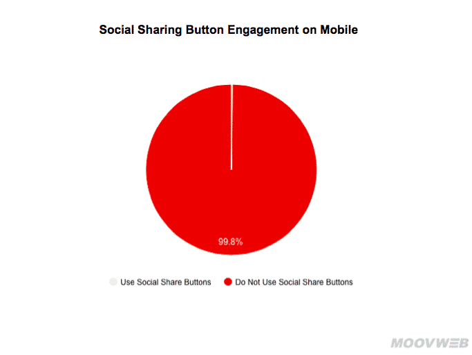
Bonus tip – Research by Moov surprisingly showed that 99.8% of visitors who see your content on mobile do not bother sharing via share buttons! I’d recommend an A/B split test of your content with and one without to see for yourself, but if you find the same result, then it’s best to drop any sharing plugin.
This will keep your site loading faster for users on mobile who notoriously have even less patience than desktop browsers. They’ll drop you like a hot potato if your website doesn’t load in 1 second or less…Ouch!
If you’re putting your heart and soul into writing content that will hit a home run, it would be unfortunate for you to lose out by getting the basics wrong.
Making sure you have these essential website features nailed down before you begin your content marketing will ensure your work has the best chance of getting in front of the valuable eyeballs you want.
If you want a quality site designed or redesigned with all of the essential website features taken care of, take a look at our professional website design services.

Need help with your website and marketing?
Book a FREE growth strategy session with our experts
Our award-winning team will review your website and marketing goals to provide you with crucial insight and advice.

4.9 STAR
Google reviews
With 10+ years of experience, Link Digital has helped hundreds of businesses to succeed online. We can help yours too!

